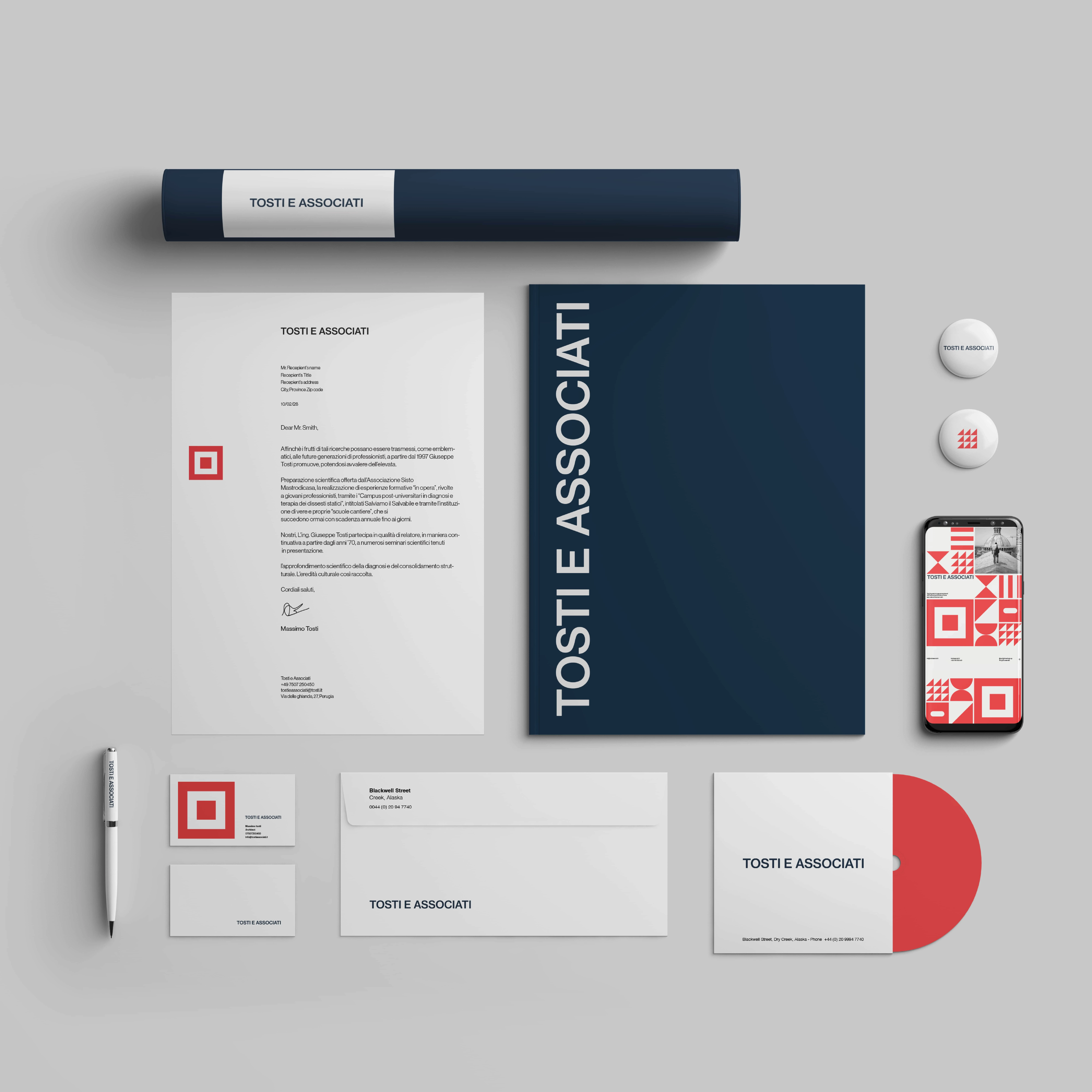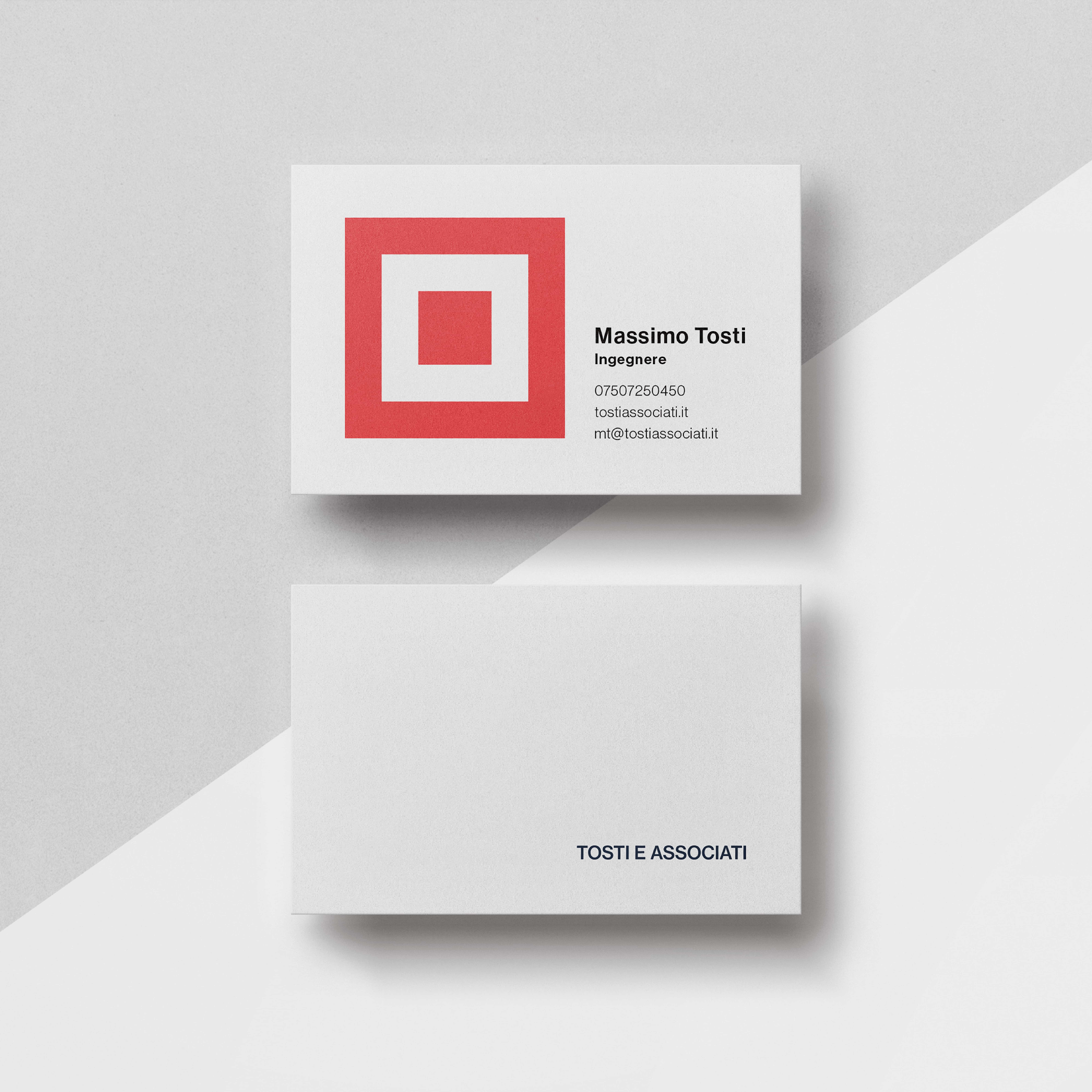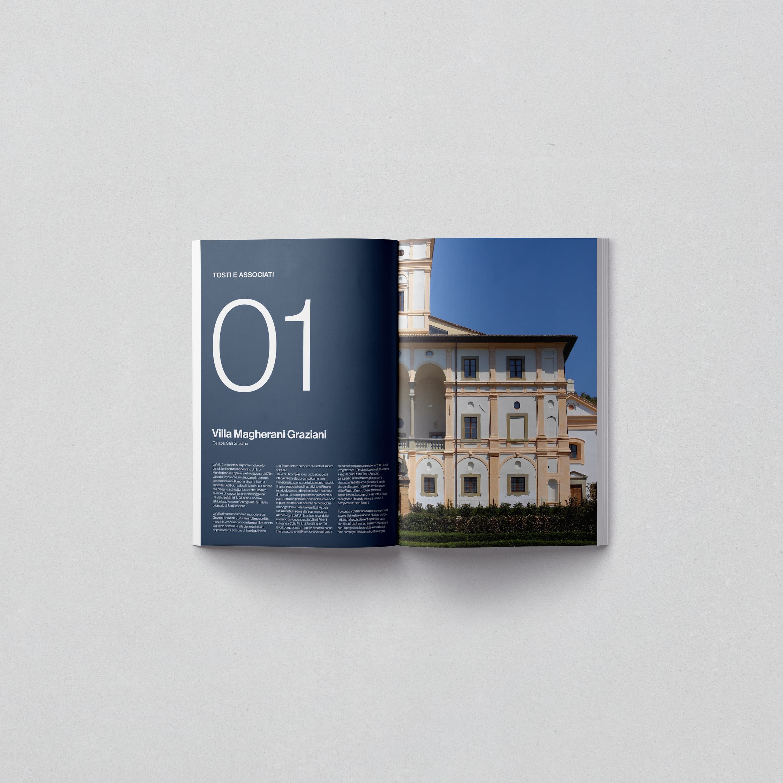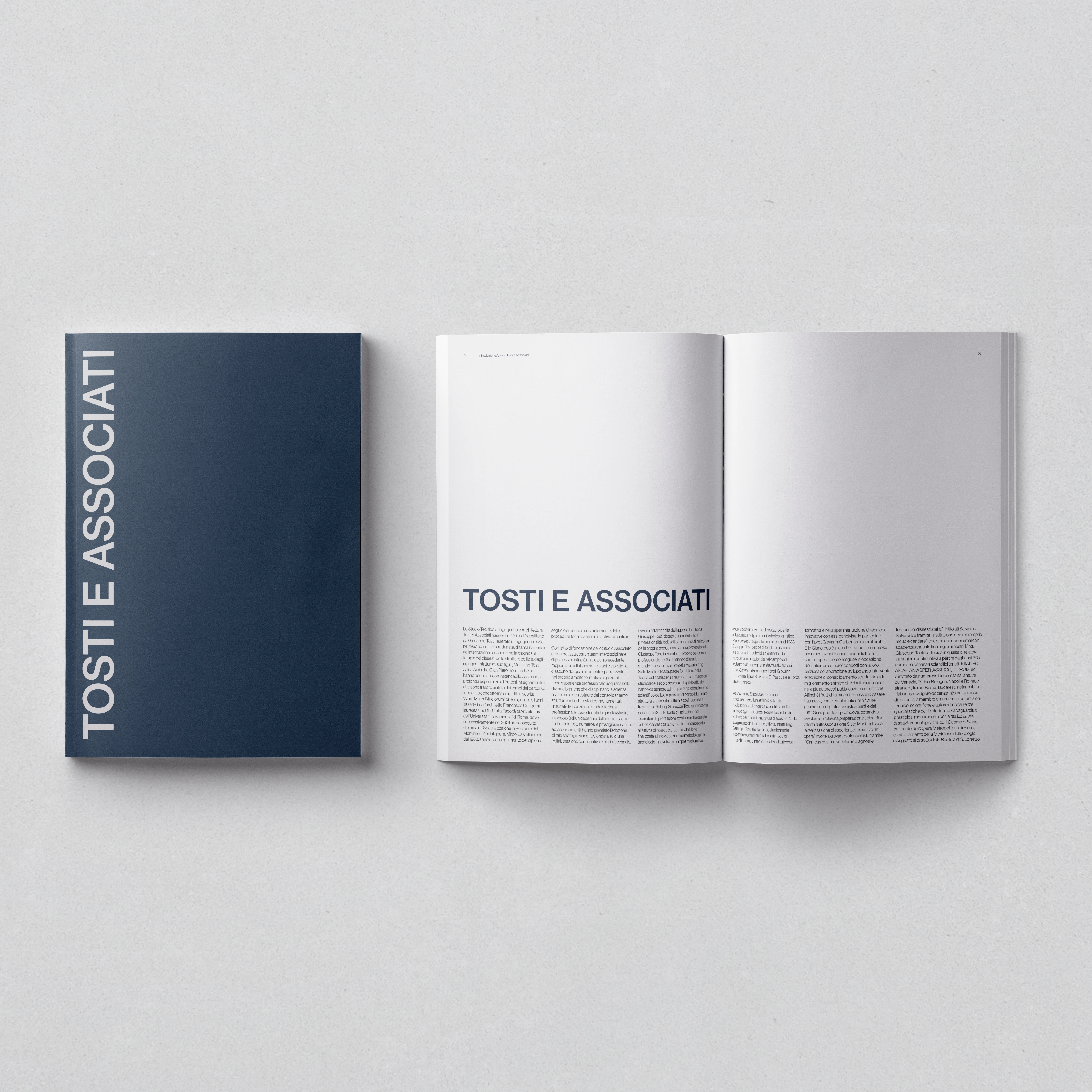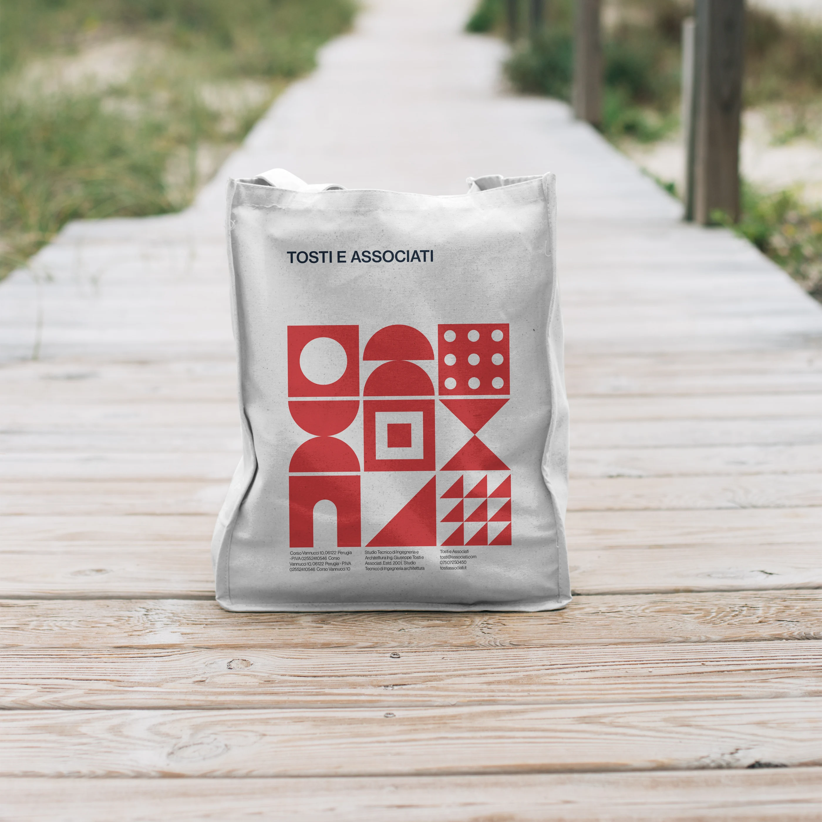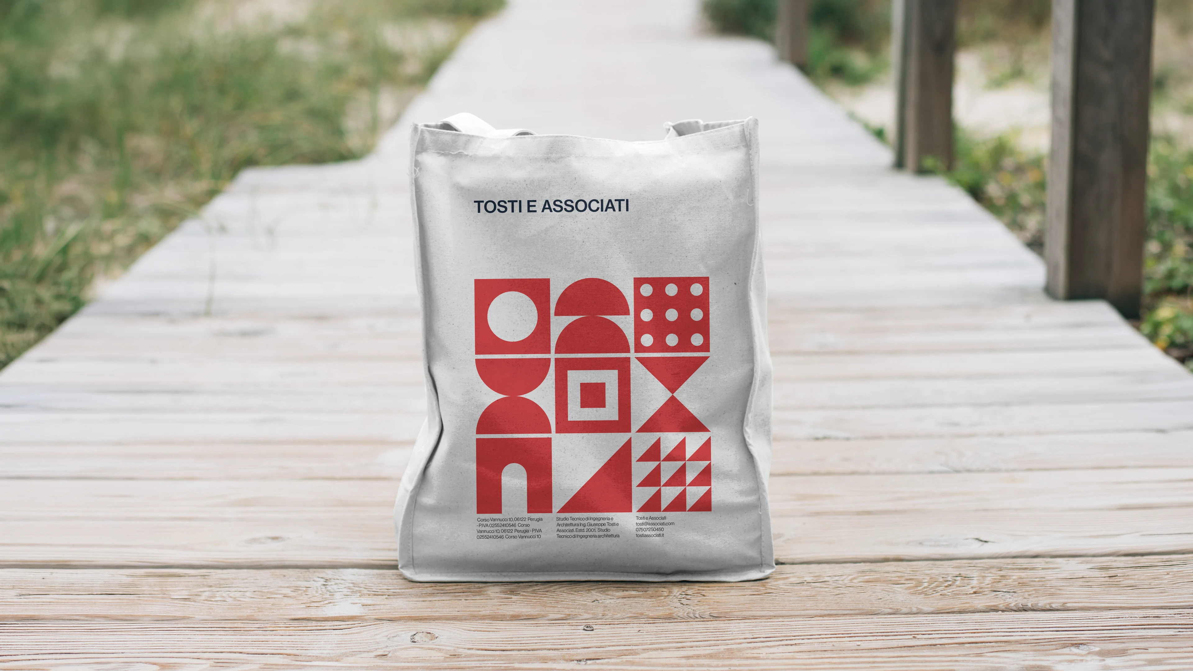

Tosti e Associati is a historic architecture studio based in Perugia, Italy, with nearly a century of shaping the city's built environment. The brief was to design a brand identity for them — reworking their existing identity to fit a more modern and empathetic visual style. I started by consulting the client on needs and requirements and proposing an ideal direction we could bring forward together. Once approved, I developed various ideas and created a full brand with mockups of possible applications across print, web, and social media. The outcome: a new logo, style sheet, business card set, letterhead set, studio brochure, brand device animation, and a concept homepage animation.