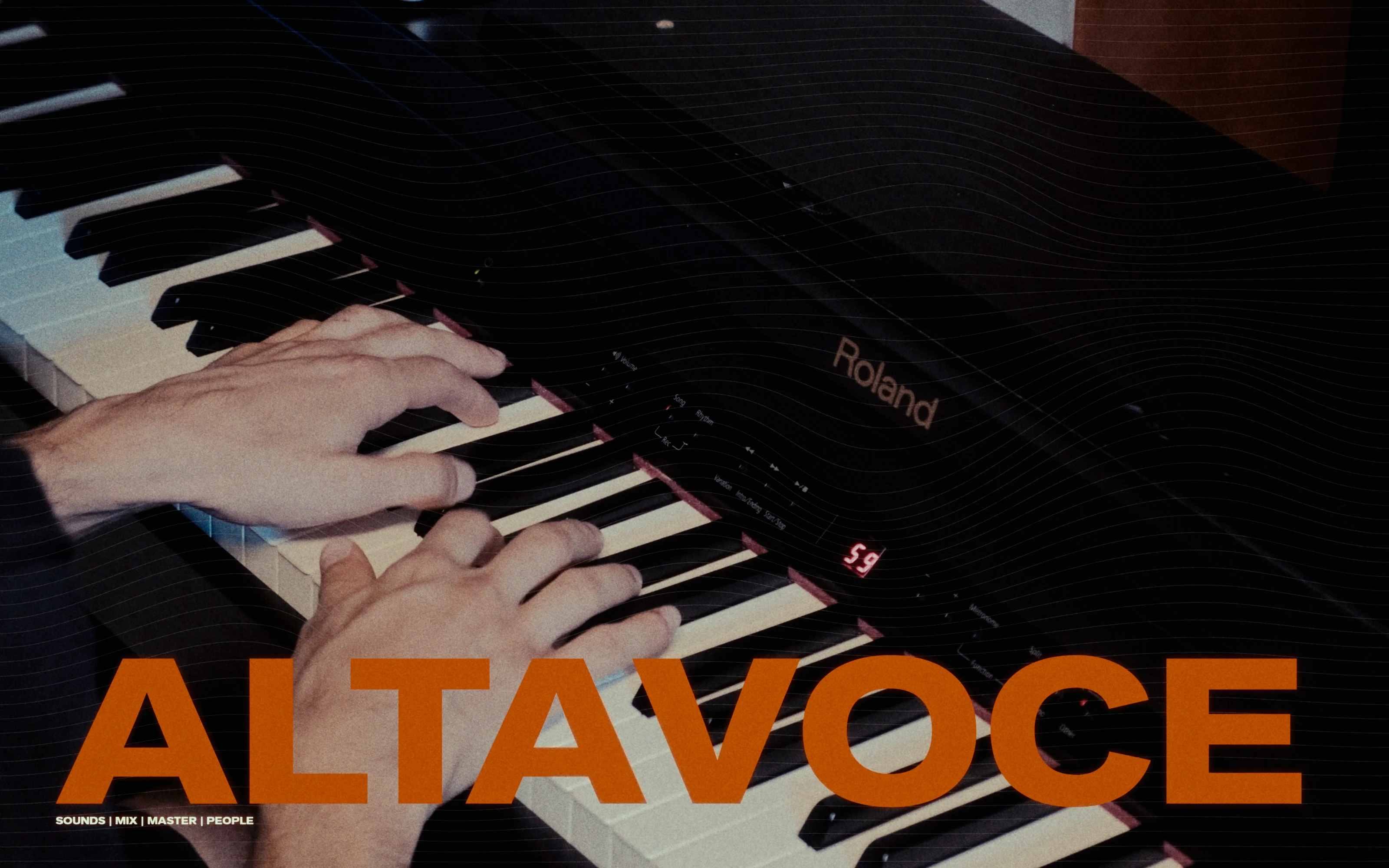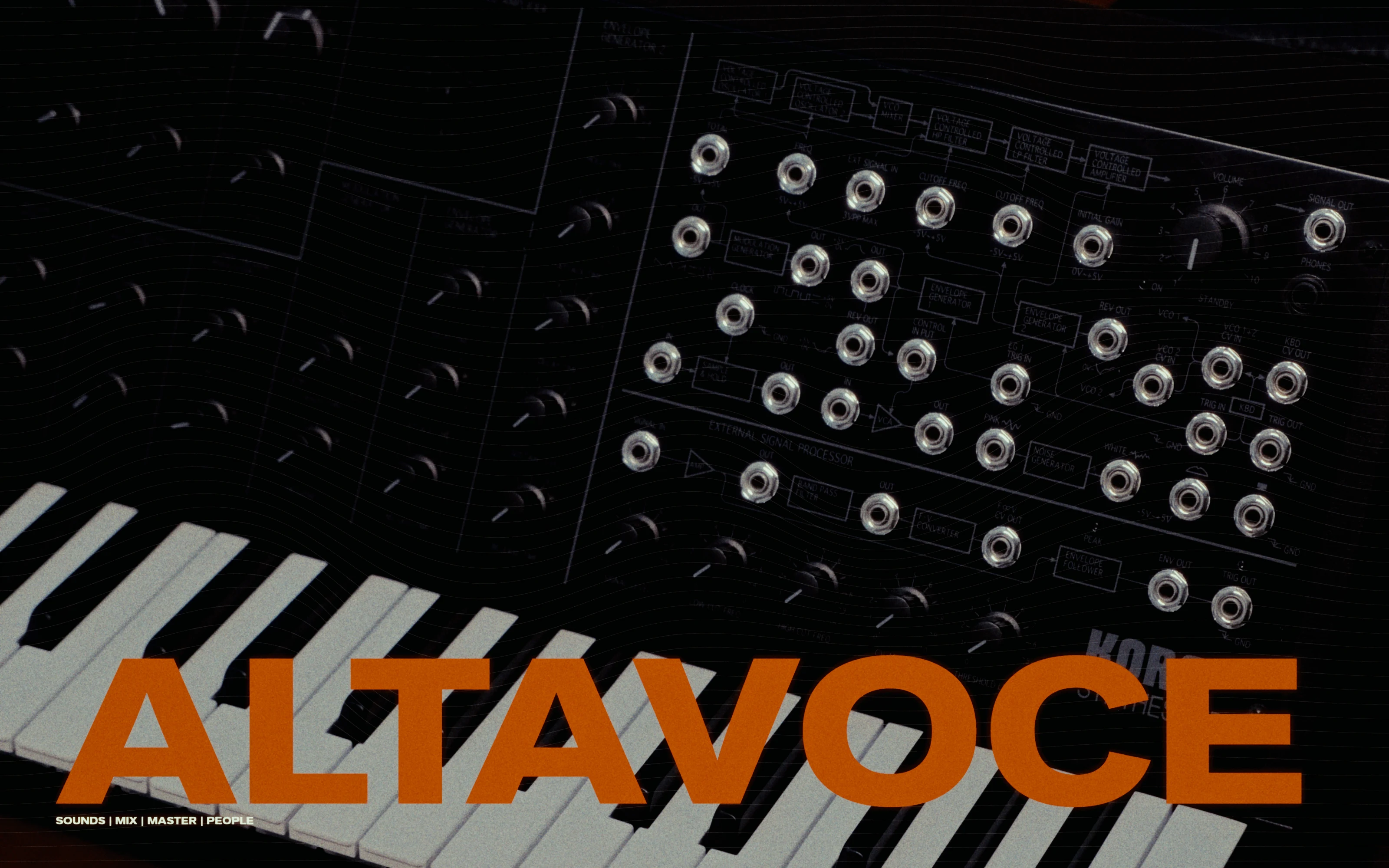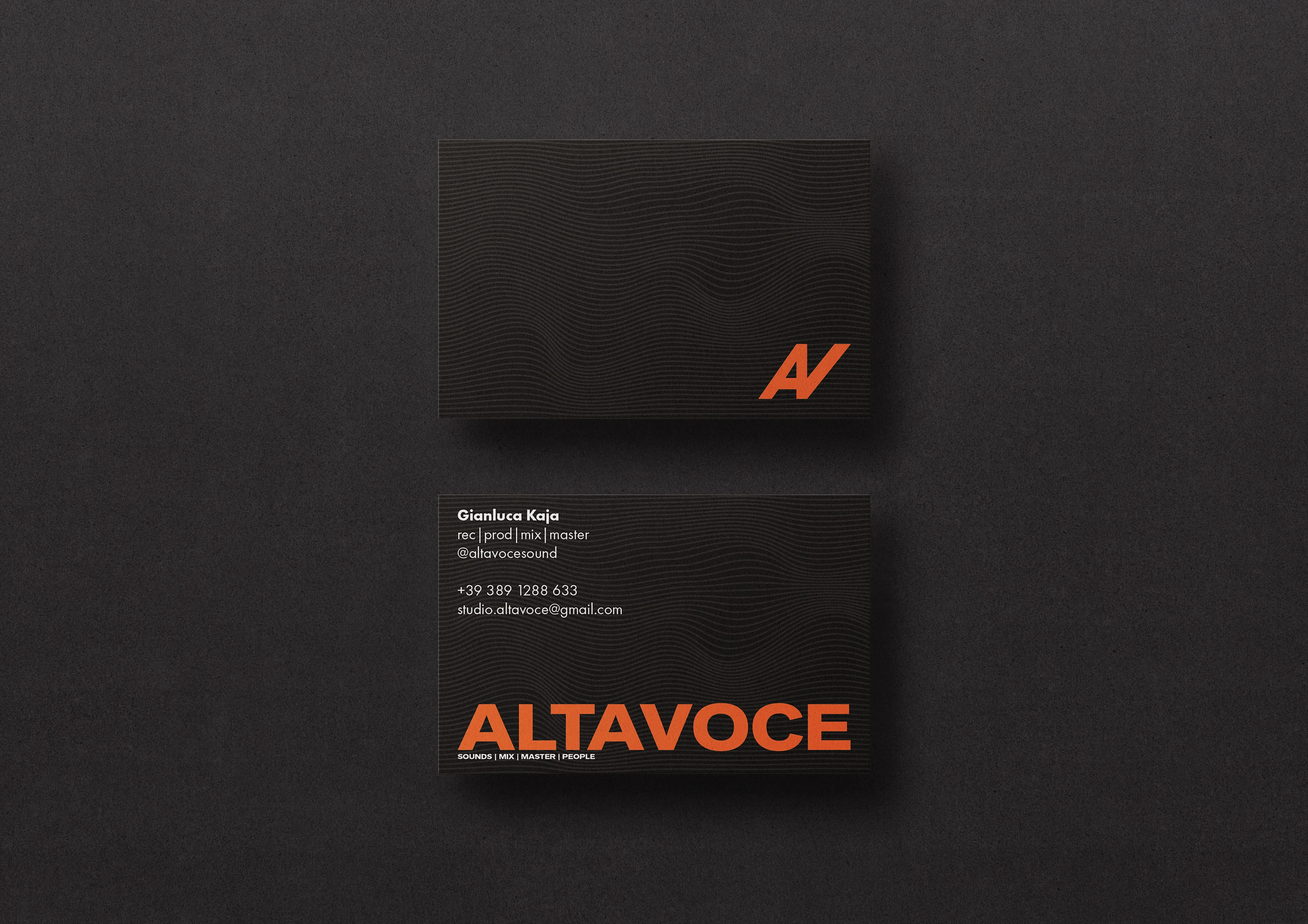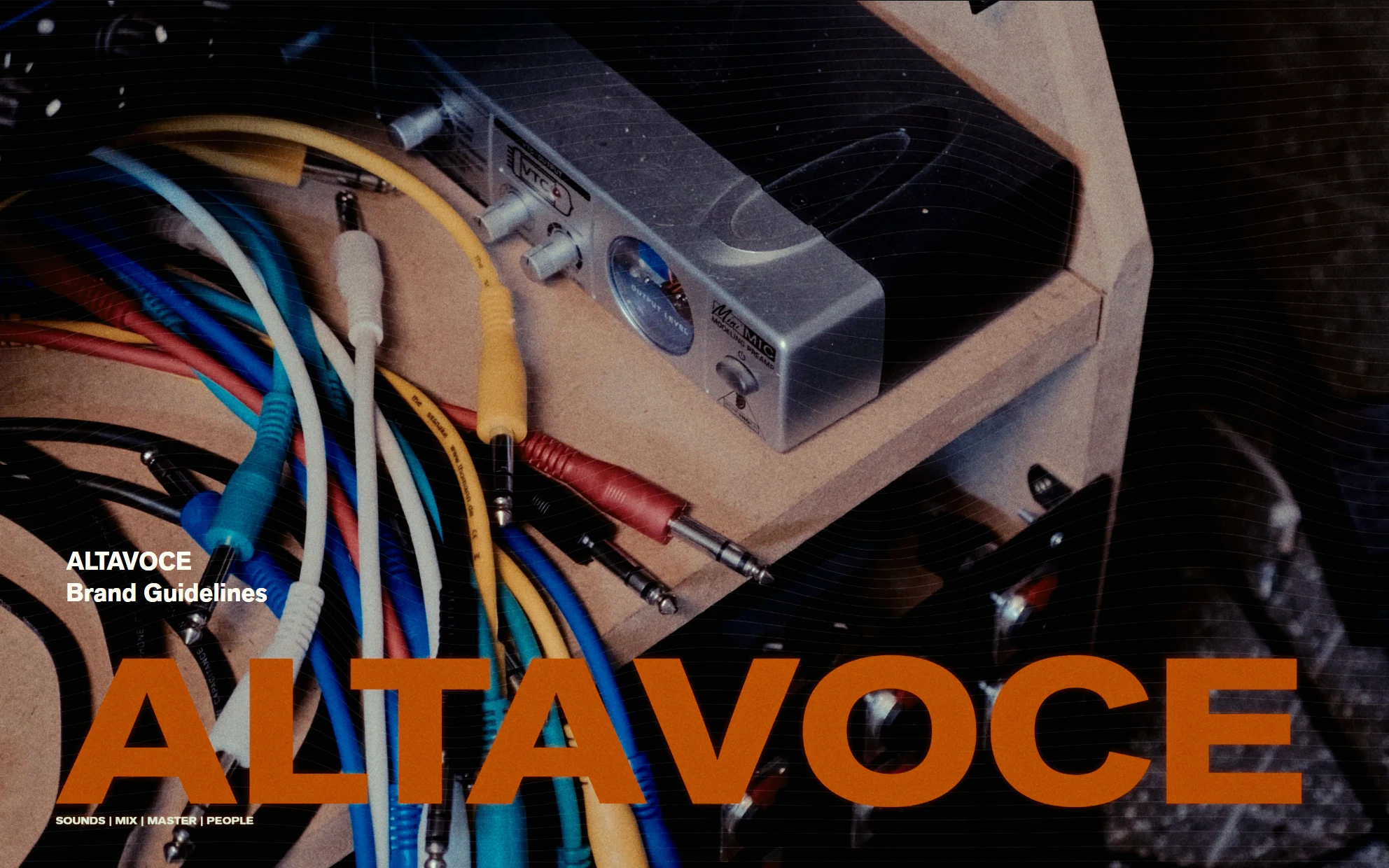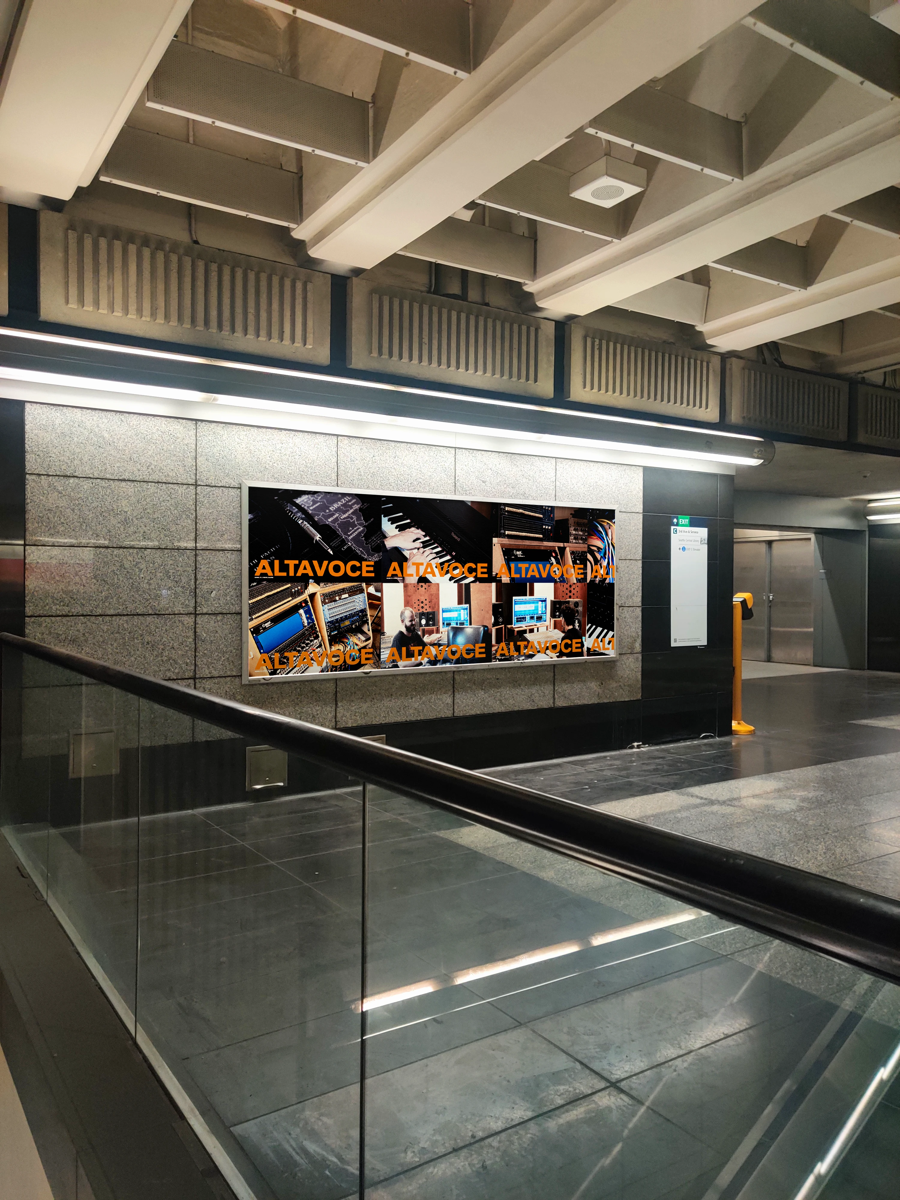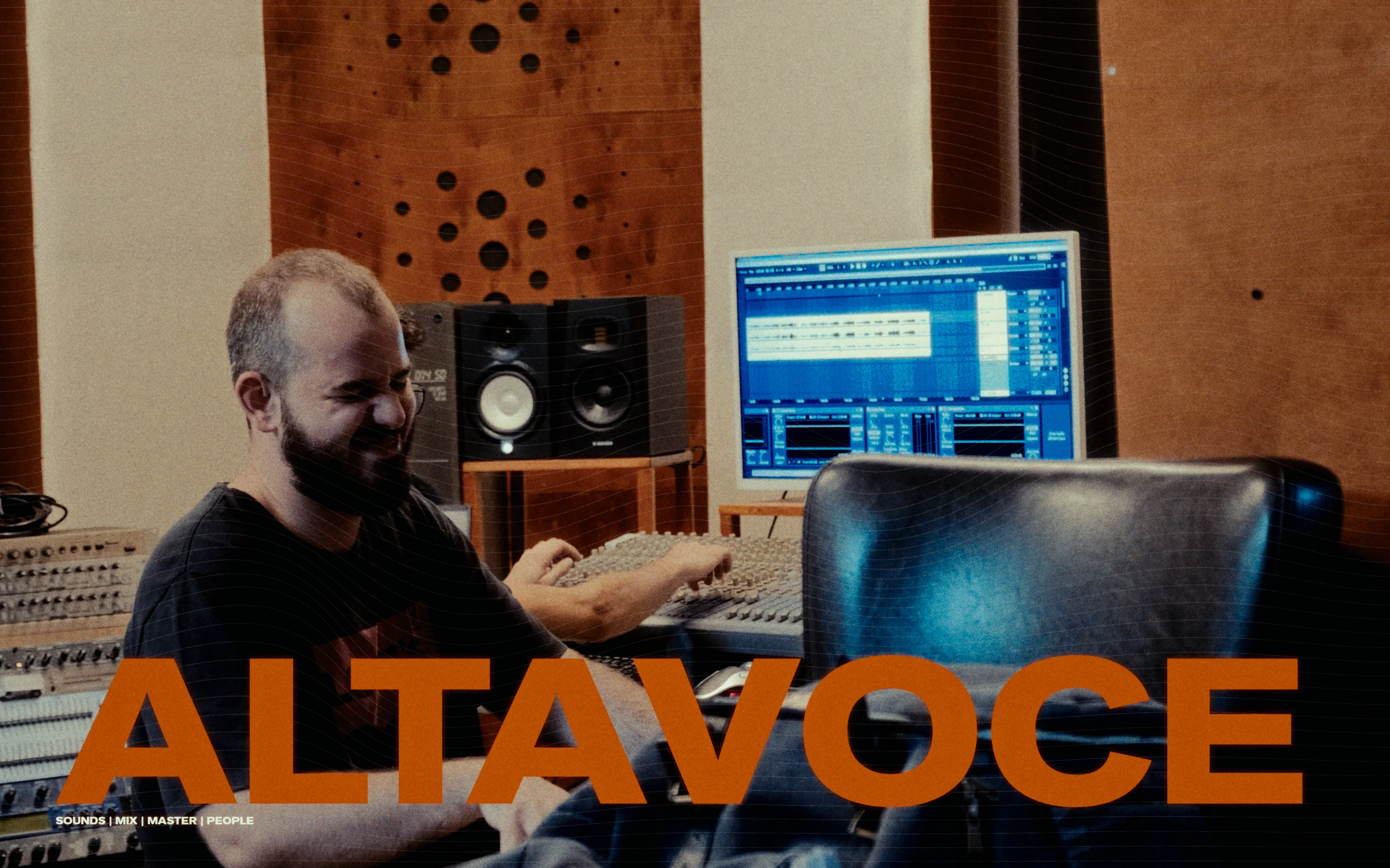

Altavoce is a Sound Design Studio in Perugia, Italy. While their country groans under the weight of an endlessly ageing population, four young and ambitious men had the audacity to build their own venture — designing a custom recording and mastering studio, and for the past few years taking on every possible job relating to sound and masters. They got in touch looking for a brand: a careful operation that needed to account for a wide range of demographics and clientele. For Altavoce, I designed a simple mark and took a highly typographical approach to their brand presence, built around the colours and environment they created for themselves — captured by my camera in a bespoke videography piece developed alongside the brand.