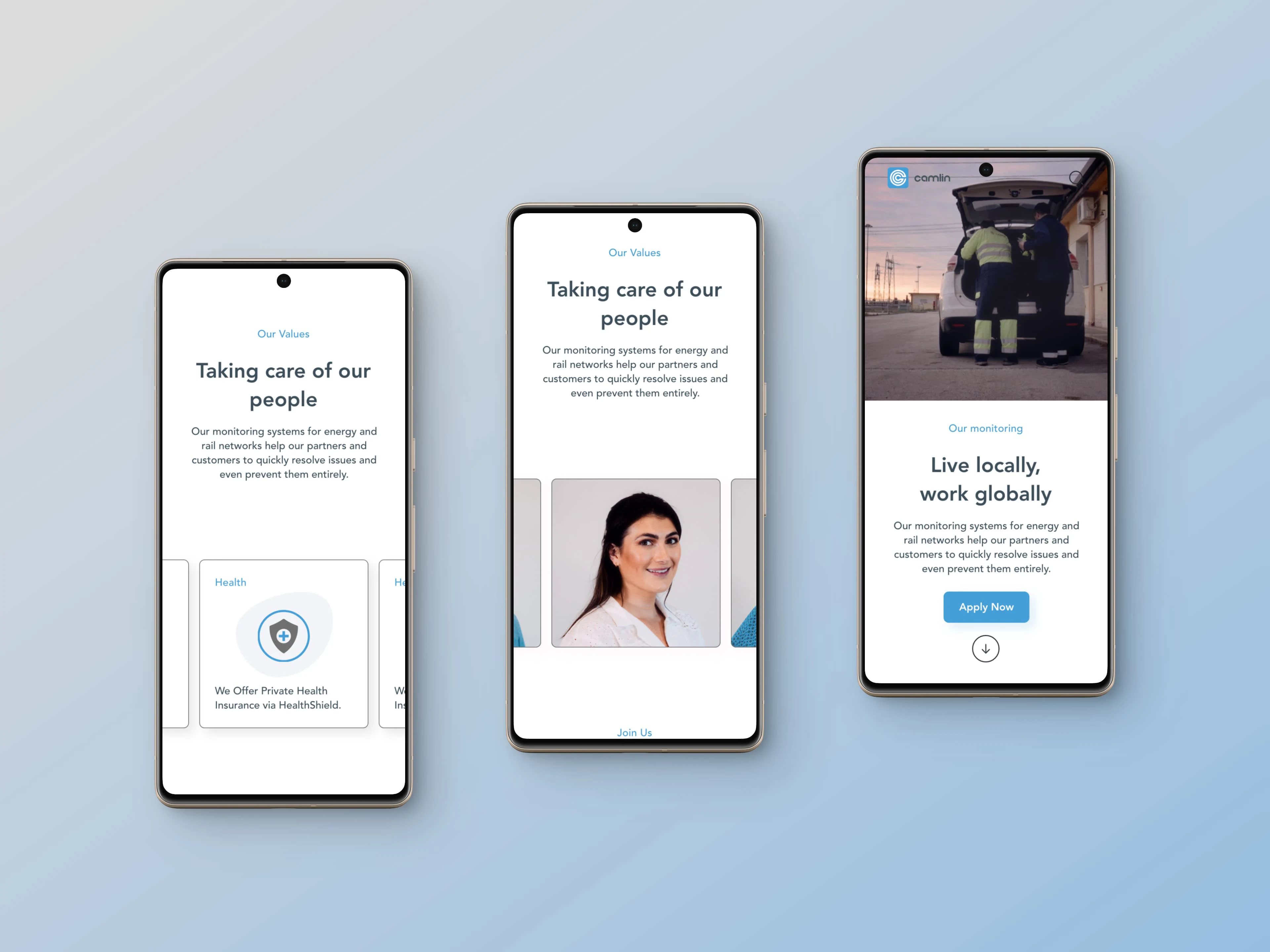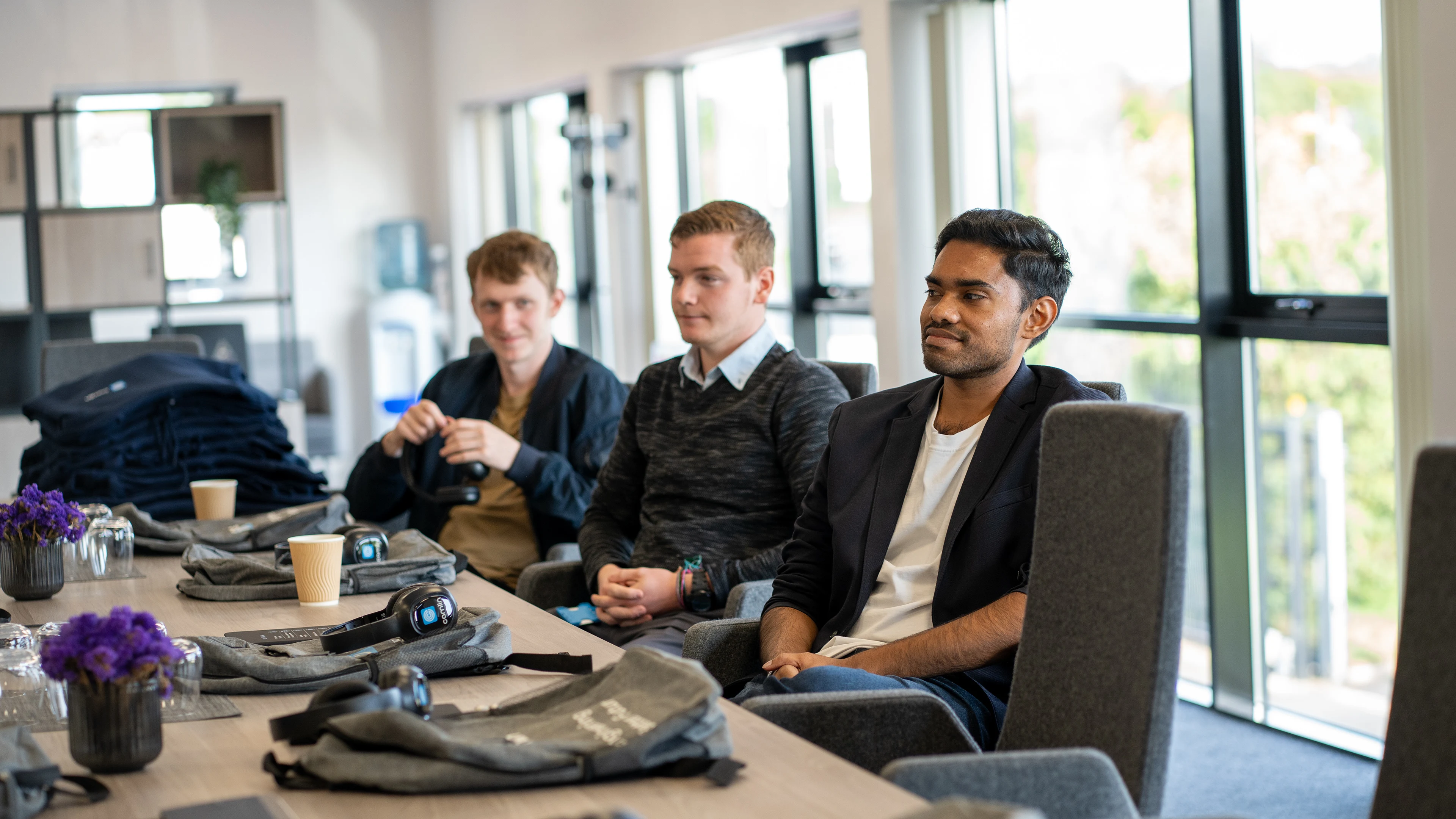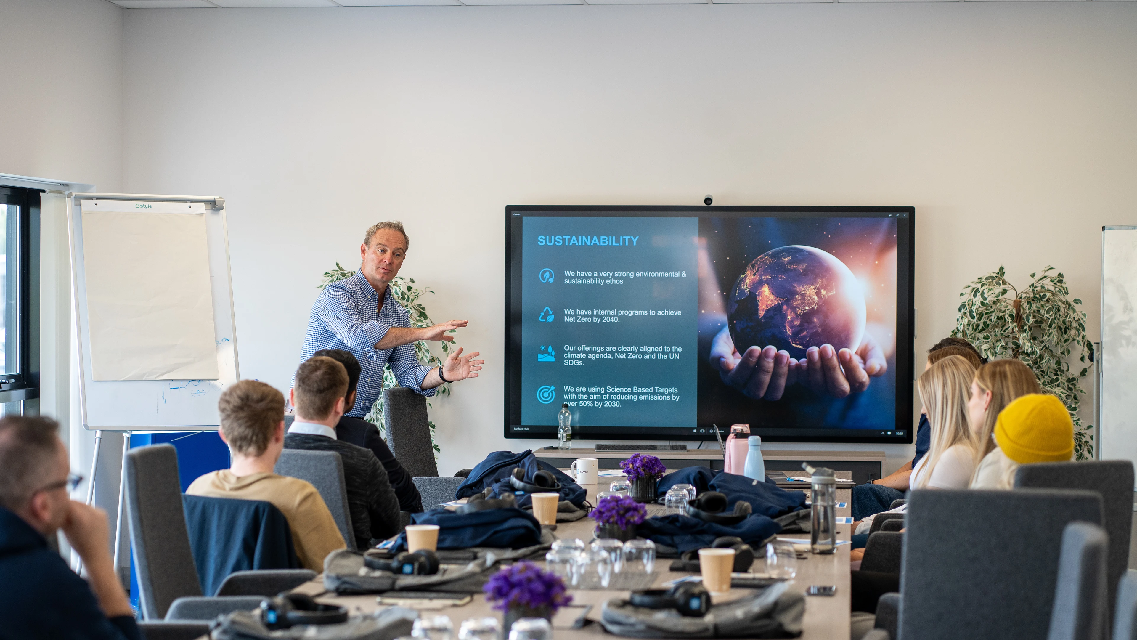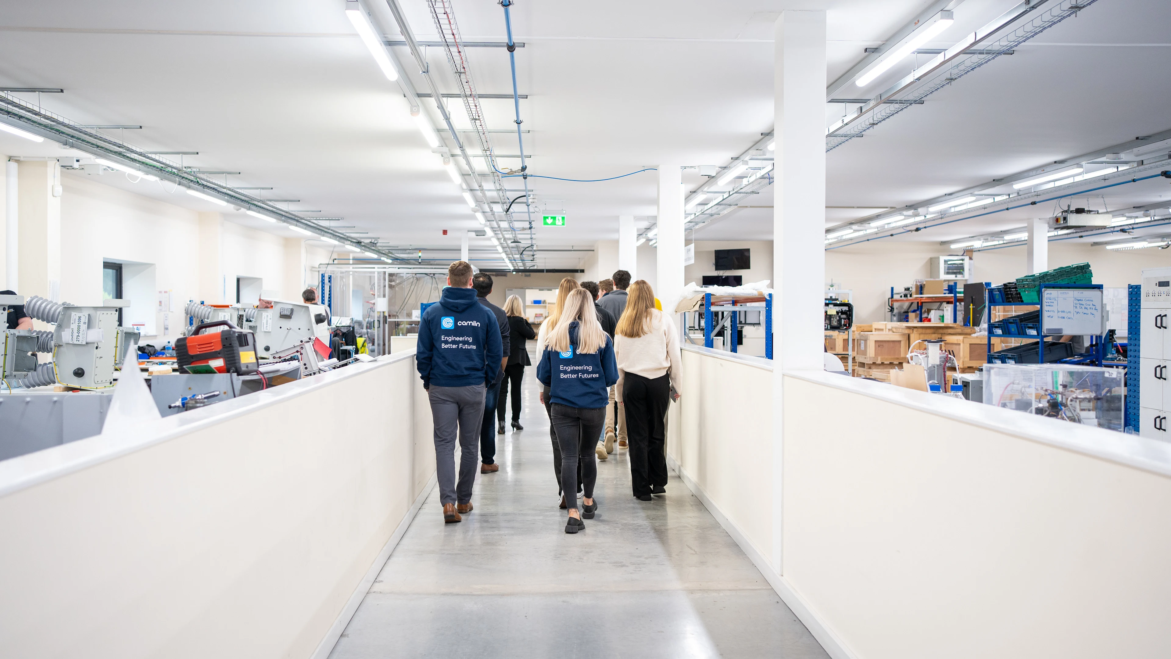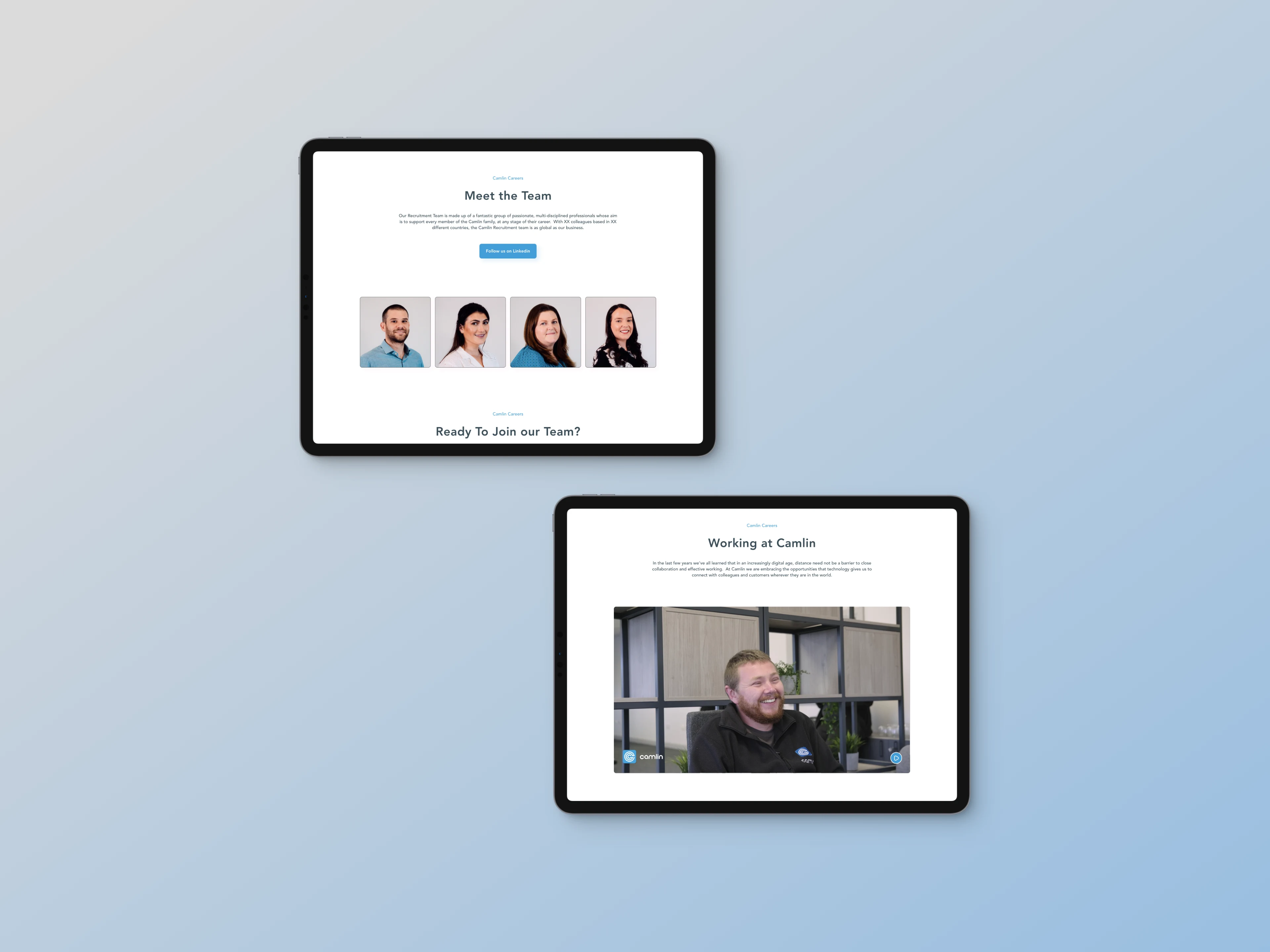

Camlin is an engineering firm based in Lisburn, Northern Ireland, at the forefront of R&D for products that aim to prevent electrical faults and save lives across the energy and railway industries. At Camlin, my skills as a creative were employed to their fullest extent. Hired as a Graphic Designer, I worked across all sorts of projects — from social media graphics, all the way to shooting and editing interviews, website design, the production of printed materials, and more. The most visible example of my input is the Careers section of the website, featuring a redesigned UX/UI experience, traditional and drone videography, photography from various events, and more.