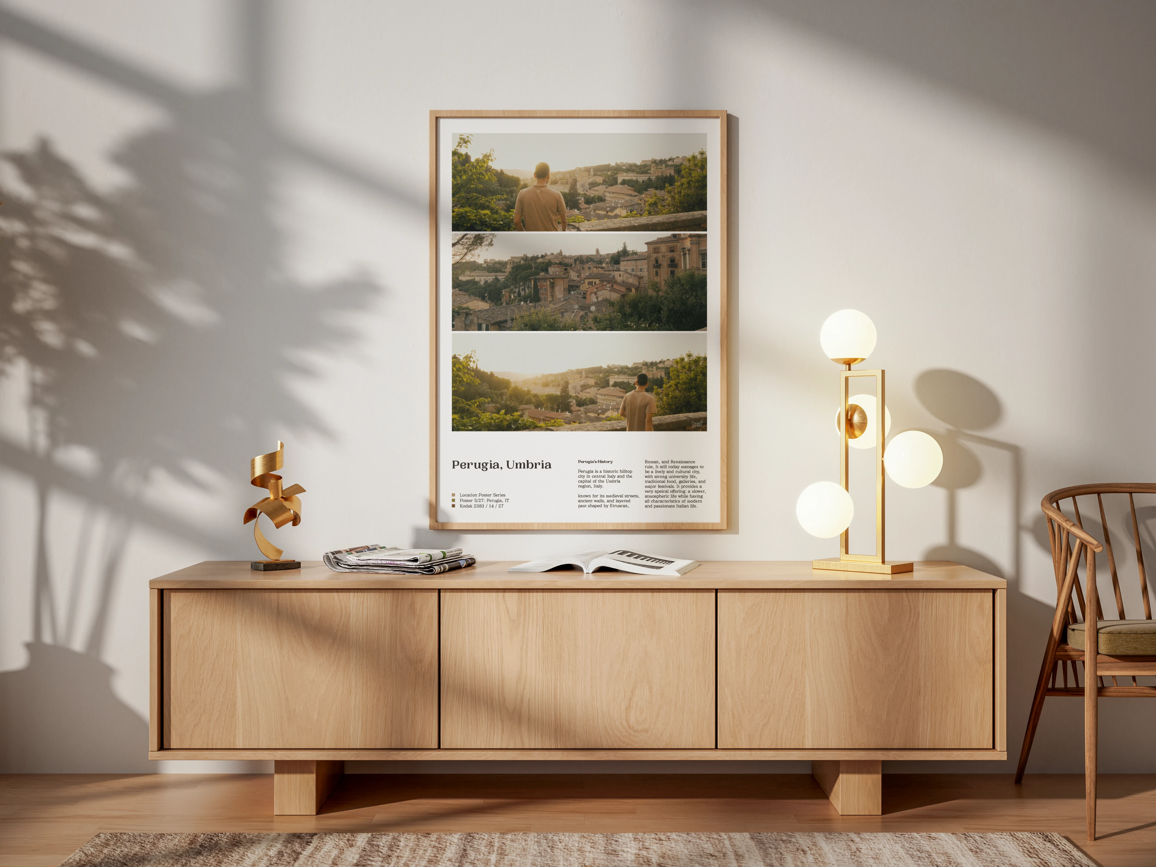

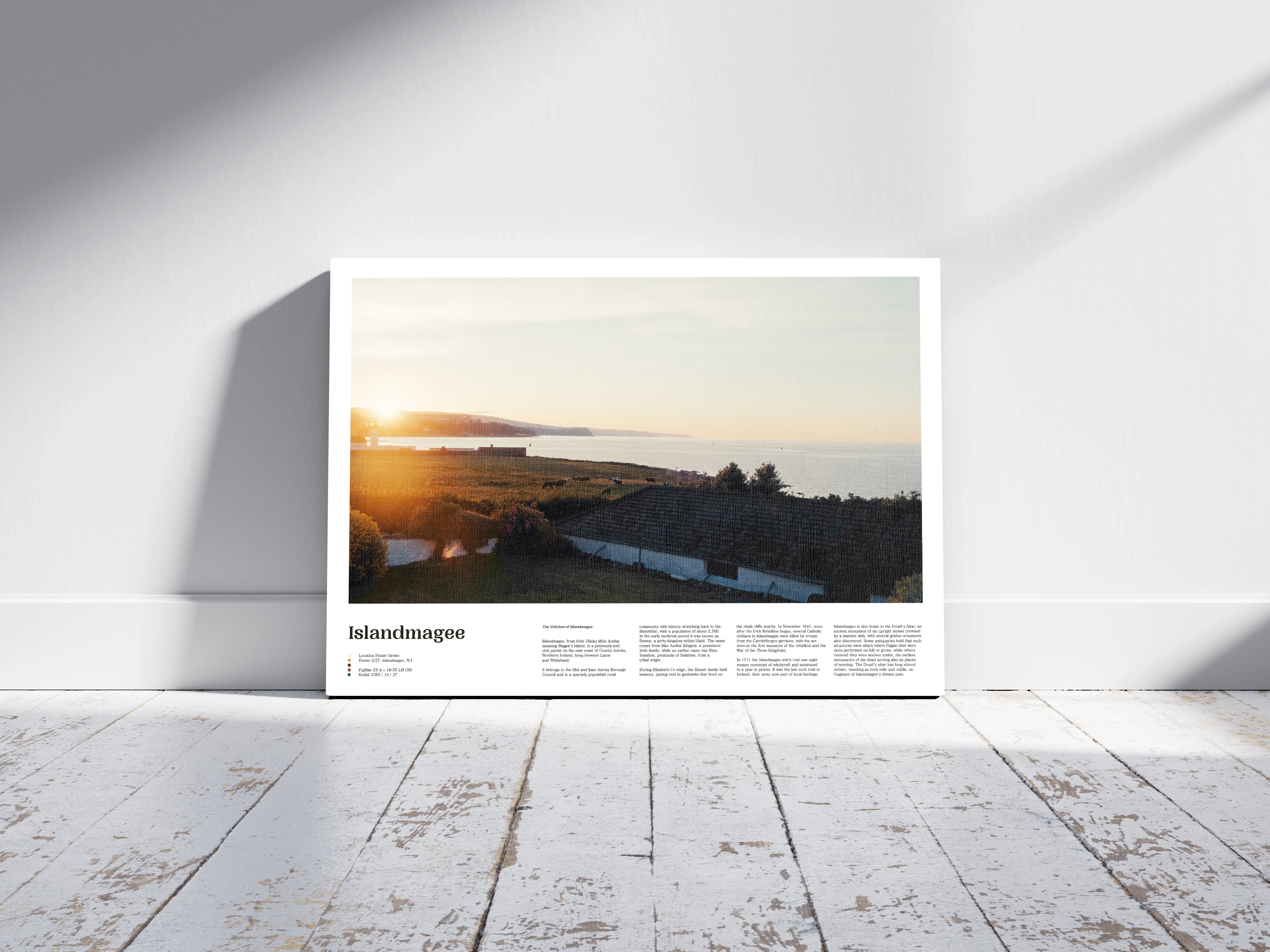
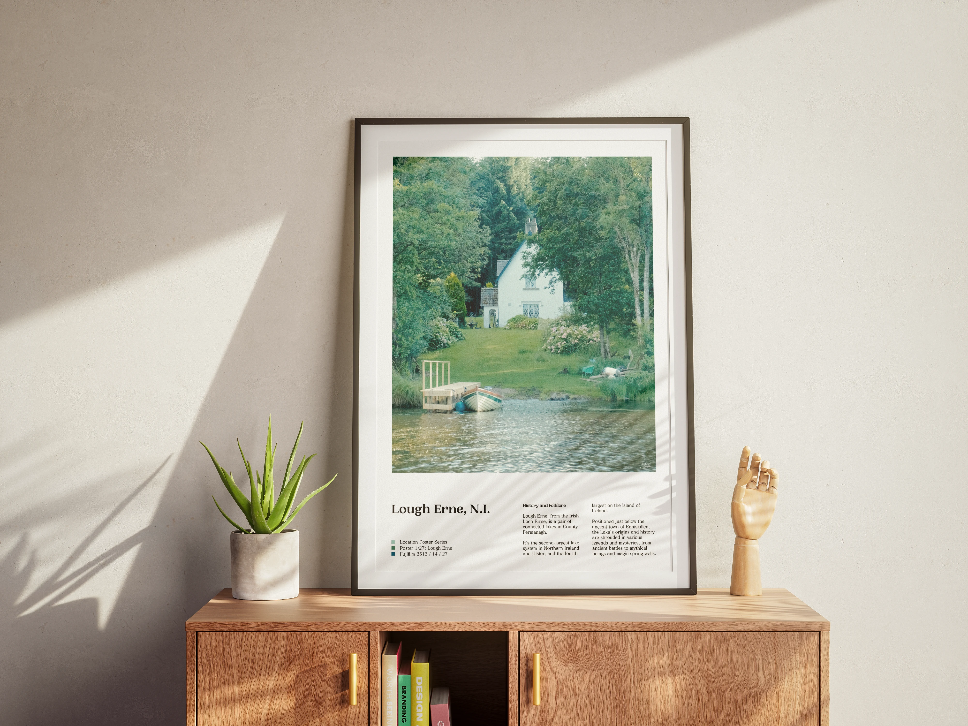
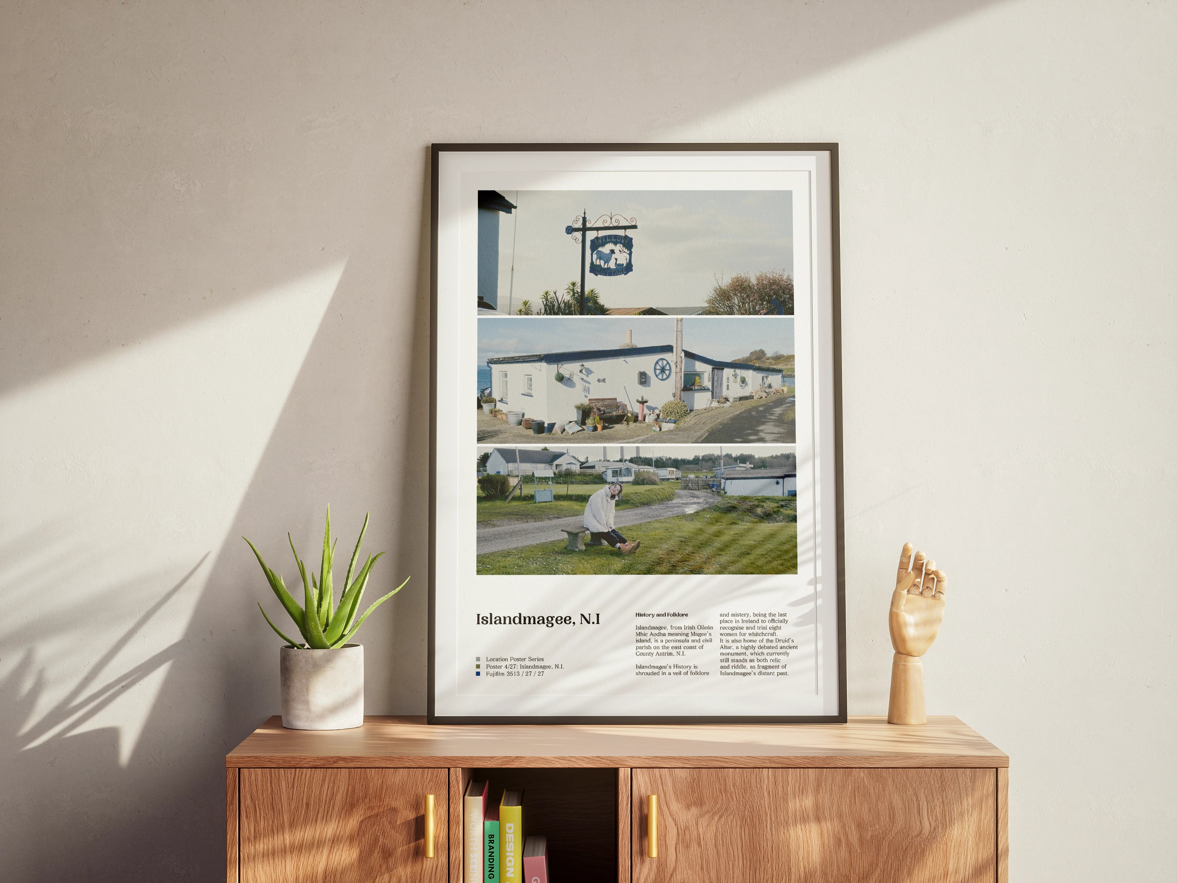
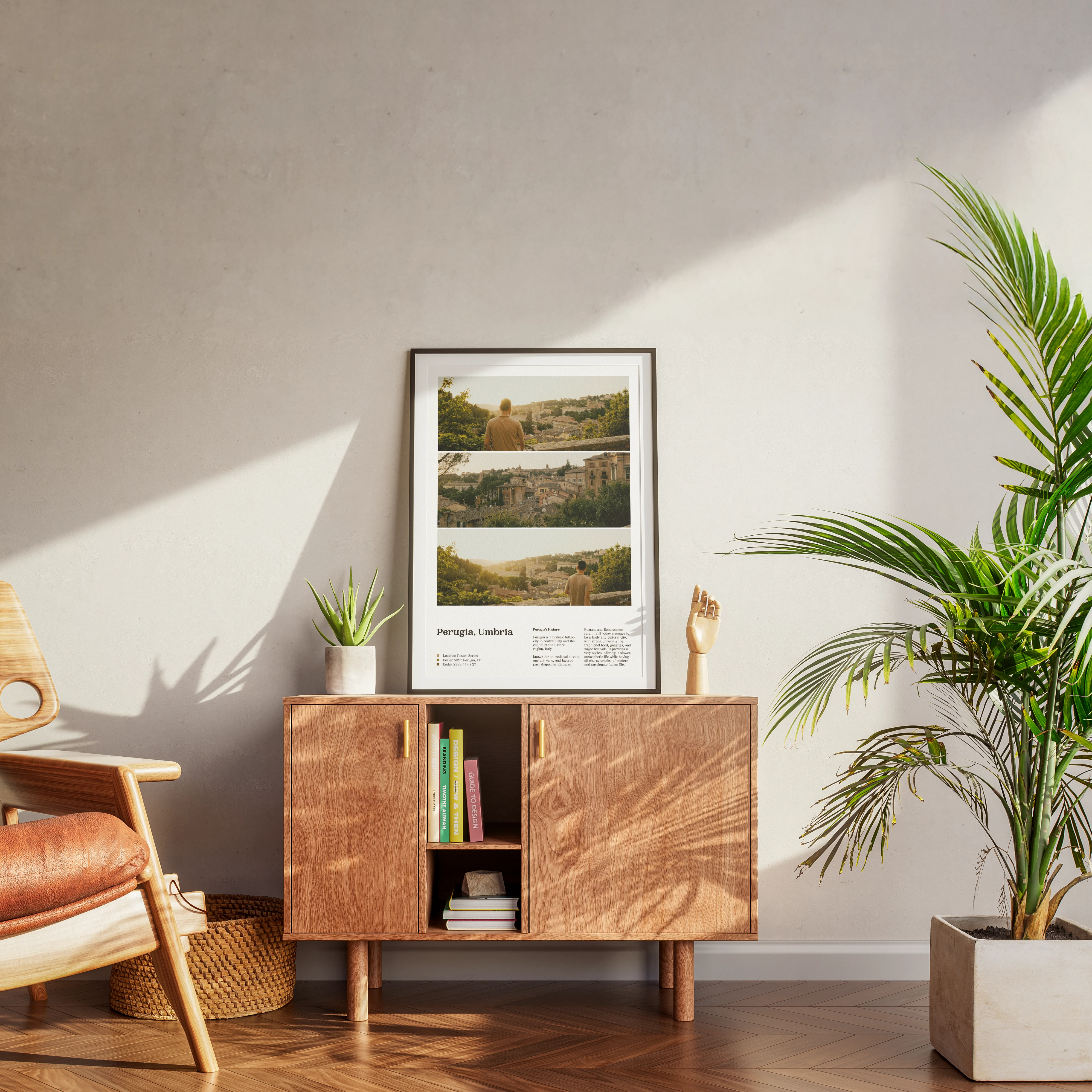
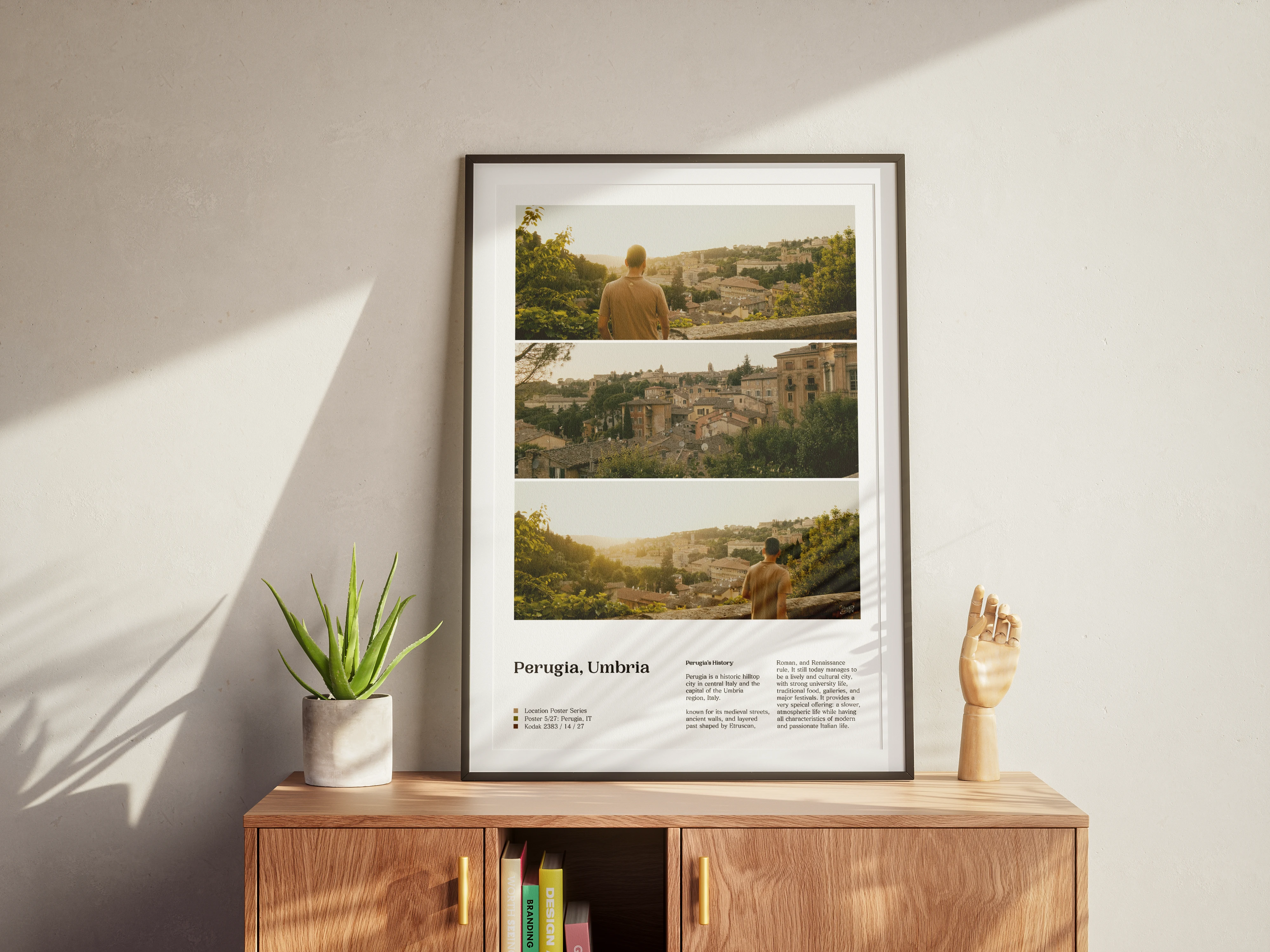
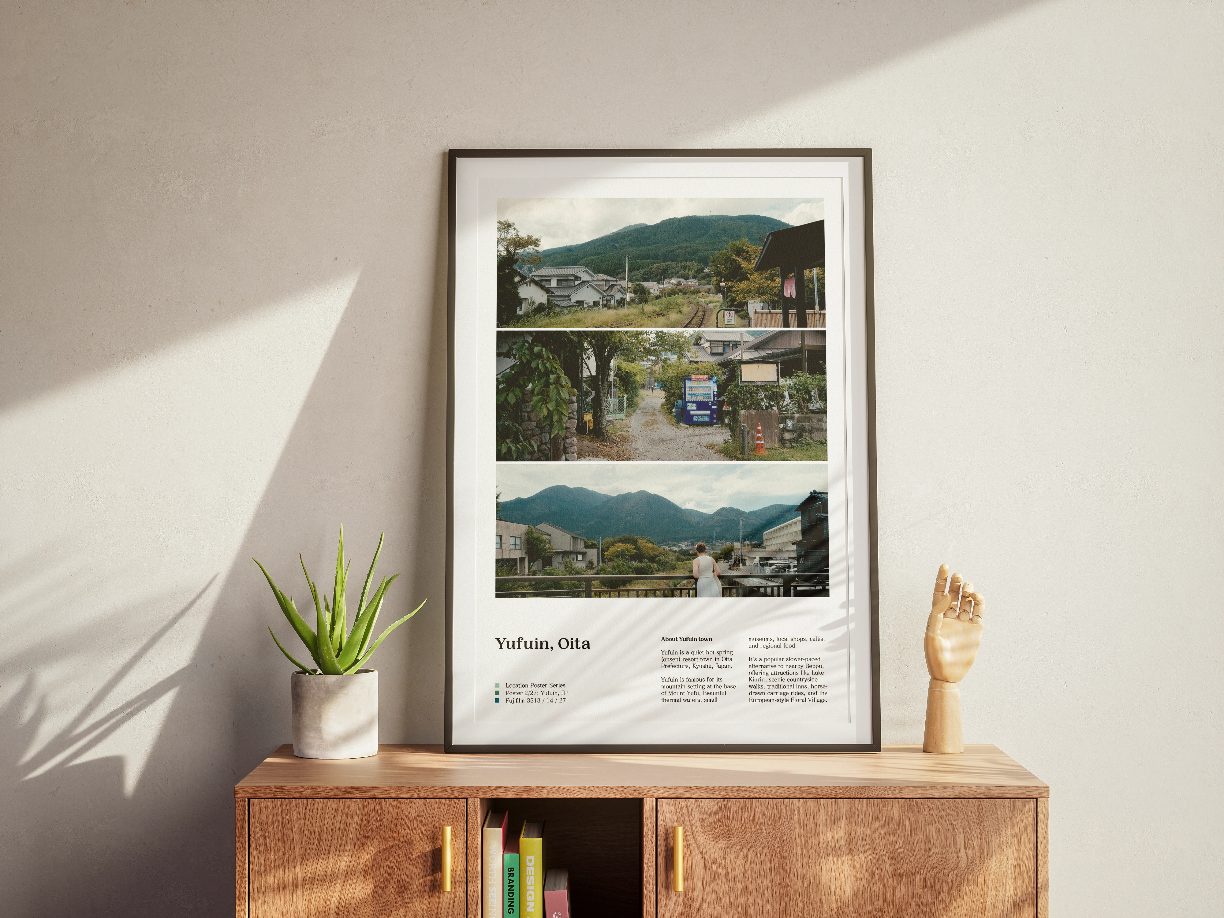
The Frame Poster Series started because I wanted to make my home look nice. That's it. It has since evolved into much more than that — featuring some of the best frames from my travel videography, paired with a unique editorial layout and bespoke storytelling. It started as a simple passion project and has become one of my most appreciated design pieces, with plans to start selling prints soon.
You may also like

